K-means: We Gotta Stay 'Vicini Vicini' (Very Close!)

If you are Italian, you might be chuckling at the title. If you are not, I’m sorry but you have to know the Gabibbo. Me 🤝 Pop culture reference.
I’m continuing my series reviewing the book Cyber Threat Hunting by Nadhem AlFardan, published by Manning. So far, I’ve written three posts covering Chapter 3, Chapter 4, and Chapter 6.
Although Chapter 7 was equally fascinating, I decided not to write a dedicated post about it for two reasons. First, this new chapter uses the same dataset, and we’ll likely reach similar conclusions. Second, I was eager to learn the integration of machine learning covered in Chapter 8. Still, I want to highlight a key takeaway from Chapter 7: the discussion on confirmation bias and how a threat hunter must recognize and mitigate it. These are soft skills, hard to teach directly, but essential to develop through practice and reflection.
In this post, we’ll explore Chapter 8: Unsupervised Machine Learning with k-means. You can find all the relevant files for this chapter in my GitHub repo.
Unsupervised machine learning with k-means.
In this chapter, we’ll take another approach and use ML to discover interesting connections in data. I should note that: I’m not a ML expert, nor a data scientist. These are tool that could be useful in our tool set. Being aware of them, knowing how and when to use them is the key.
The scenario is the following, we will use the same dataset used in Chapter 7 (the reader will forget me if I didn’t blog about it). Chapter 7 introduced the concept of jitter: a random amount of time that gets added to the sleep time of an agent before making a call home to a C2 server. A more realistic attack in a way, so statistical constructs such as standard deviation are useful but not sufficient. So, the author introduced the concept of interquartile range (IQR) and how to use them. Here’s an excerpt from the book:
We use the data set from chapter 7 to see how ML can address the same hypothesis: an adversary took control of one or more internal hosts, which then started to beacon with jitter added to a command-and-control (C2) server using any TCP or UDP port. We do not know the time interval between the call-home connections or the percentage of jitter added.
Also I wanted to report this sentence, which really embed the meaning of this chapter:
This chapter is the first time in this book that we’ll reuse a data set, for good reason: to demonstrate with an example how and when unsupervised ML is helpful when we don’t have specific indicators to search for.
Data preparation
As before, when working with a sparse dataset, you will need to prepare it before applying ML techniques. The preparation faced in the book’s chapter consist of:
- Removing empty cells
- Removing large number of unique values
- Analyzing what fields highly correlates with other fields
- Converting string into numerical values.
These techniques are, of course, dataset dependent.
The data preparation steps are not included in this chapter. I’ll reference insights or filters introduced in the book without reproducing every detail. If you're interested in the full context, I highly recommend checking out the original source.
The logic and the code behind each step of the data preparation is in the Jupyter Notebook, you can refer to it if curious about those steps. I will skip directly to the fourth point.
About the fourth point, the author mentions two techniques, which are:
- Label encoding: it converts each value in a column to a number. Numerical values range between 0 and
total_categories -1, wheretotal_categoriesis the total number of unique values in a field; - One-hot encoding: it converts a non-numeric column to n columns containing 1s and 0s, where n is the number of unique values in the original column.
For this particular example, one-hot encoding suits better our needs (e.g. label encoding assigning a higher value for some data point and some ML algorithms may give higher priority to labels assigned higher value).
I tried to create with matplotlib (Python data visualization library) a visual representation of one-hot encoding (if interested, the script is available here):
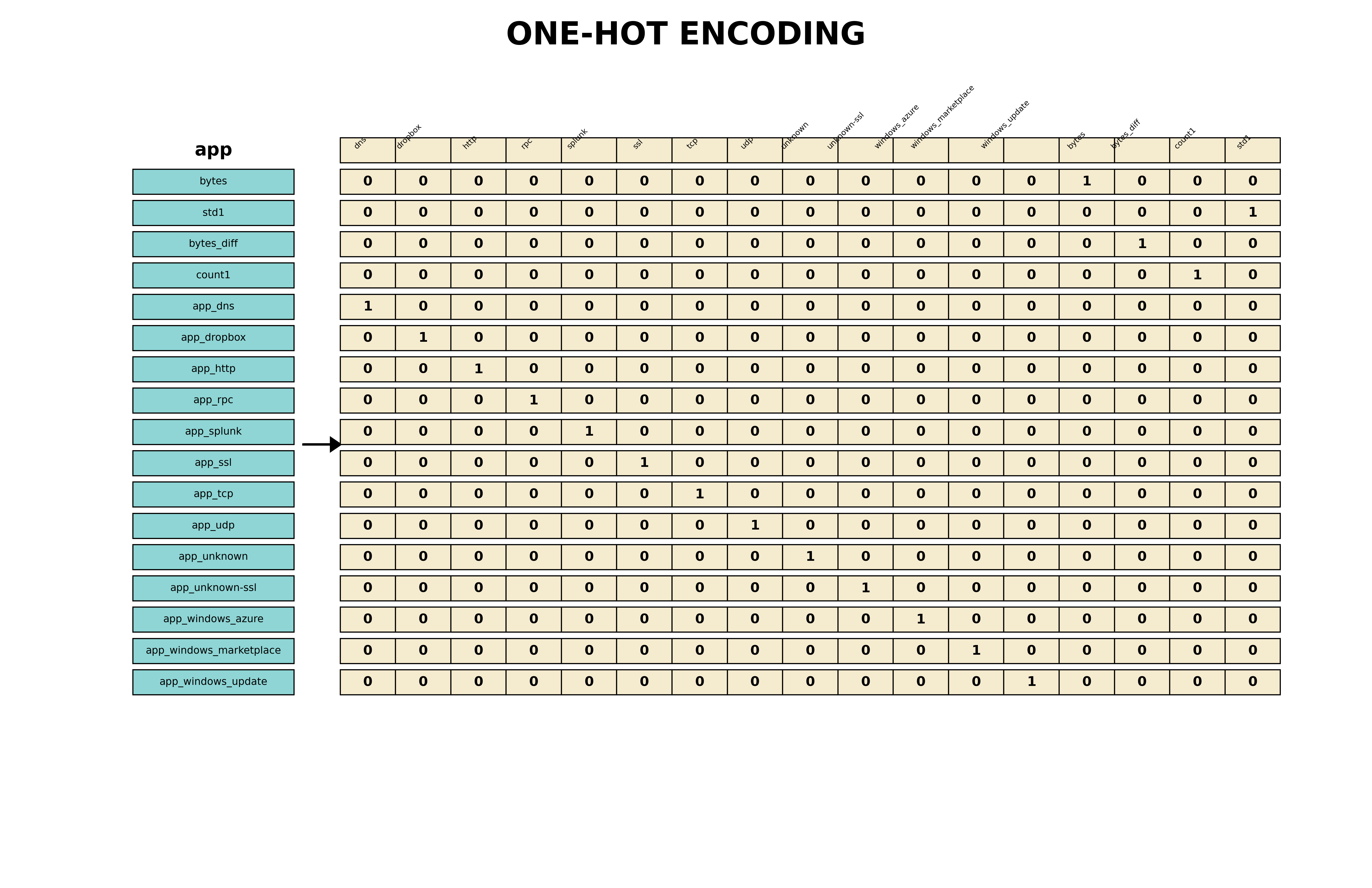
Keep in mind that one-hot encoding is not a panacea, it can cause the curse of dimensionality. After that, it is calculated the pairwise correlation heatmap, in order to visualize and dropping the highly correlated fields (when two variables are highly correlated, we can keep one and drop the other).
Finally we can use some ML core work, but why? We will use an unsupervised machine learning method, which means using math (euclidean distance) we will try to uncover some patterns in unlabeled data. But it is important to remember the initial hypothesis:
an adversary was able to take control of one or more internal hosts, which then started to beacon with jitter added to a C2 server using any TCP or UDP port. We don’t know the time interval between the call-home connections or the percentage of jitter added.
So ML in a sense is a really powerful tool to discover if our hypothesis is strong and if it needs some refinements.
Using K-means
K-means is a clustering algorithm, intuitively, it groups data points into k predefined groups. All the data points gravitates towards a centroid, which is the center of that cluster. It's an iterative process of assigning points to the nearest centroid and then recalculating centroids.
K-means data needs to be normalized, because it is affected by the magnitude of the features. So all the features need to be in the same scale, k-means is biased towards variables with higher magnitudes (e.g. bytes is in the thousands, app is ones and zeros).
Also another name for normalization is feature scaling.
Choosing the k is crucial; it can be chosen via domain expertise, or see how the data behave when plotted. For example, here’s a pairwise plotting of the algorithm. Using the following code, we plot the pairwise relationships in data set df_features_one_hot_enc for selected features:
sns.pairplot(df_features_one_hot_enc, vars=\
    ['bytes', 'std1', 'count1', 'app_dns', 'app_dropbox',\
        'app_http'], diag_kind='kde')
plt.show()
We have the following image as result:
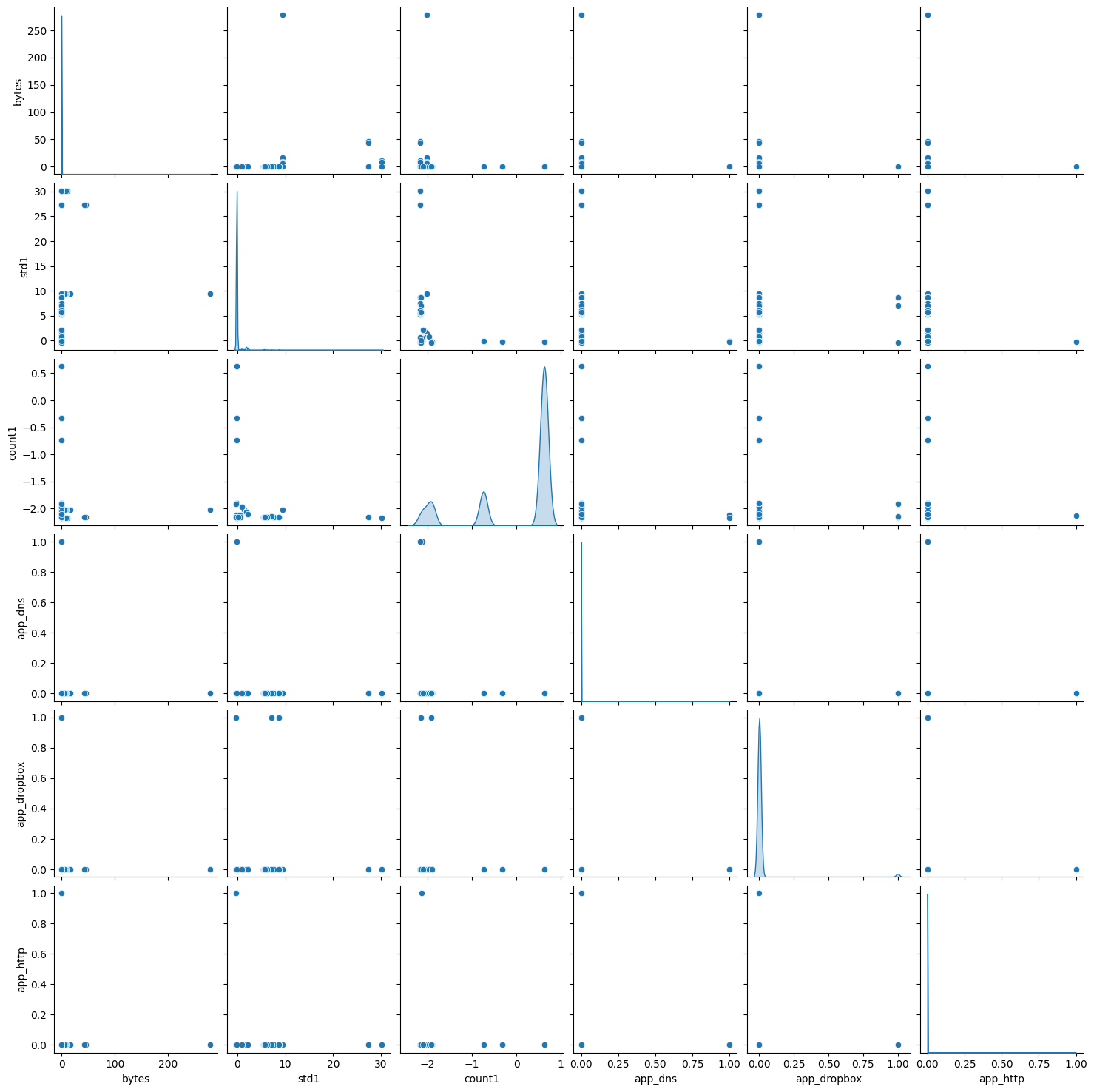
Unfortunately, we cannot draw solid conclusion from this; reality often is messy and easy heuristics do not work.
So, in order to estimate the k value, we can use the elbow method and the Silhouette analysis.
The elbow method, as stated in the book, is:
The elbow method relies on running k-means for different values of k (such as 2 to 9) and calculating the sum of square errors (SSE), also referred to as the distortion score, from each point to its assigned center for every value of k. Then we plot the value of SSE versus k to find the point in the plot where an elbow bend appears.
For the calculation we’ll use Yellowbrick ML library. The code used is:
from yellowbrick.cluster import KElbowVisualizer
from sklearn.cluster import KMeans

model = KMeans()
visualizer = KElbowVisualizer(model, k=(2,10))

visualizer.fit(df_features_one_hot_enc)
visualizer.show()
The results of calculating the k using the elbow method is 4. It took about 50 minutes of compute time.
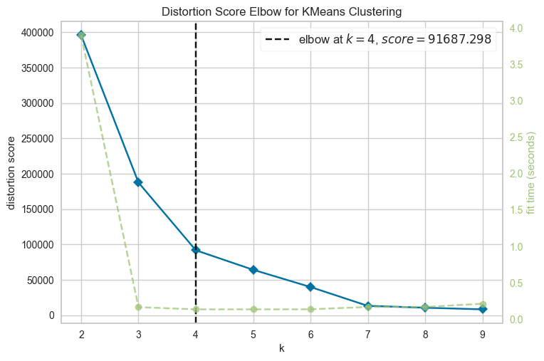
Even tough visually is not clear, Yellowbrick ML visualization indicates that 4 is probably the optimal k; note that we should not discard the other value (for example k>4).
Finally, we can apply the k-means methods: we are not recreating the algorithm from scratch (tough would be an interesting challenge), instead we’ll use the scikit library implementation.
So, with the following code:
km = KMeans(n_clusters = 4)
km.fit(df_features_one_hot_enc)
df_features_one_hot_enc['cluster'] = km.labels_
df_features_one_hot_enc.head()
We get this result (split into two table for better viz):
| bytes | std1 | count1 | app_dns | app_dropbox | app_http | app_rpc | |
|---|---|---|---|---|---|---|---|
| 10134 | 0.003270 | 0.687013 | -2.159939 | False | False | False | False |
| 10707 | 0.001234 | -0.320883 | -2.163017 | False | False | False | False |
| 10711 | 0.001775 | -0.320500 | -2.159734 | False | False | False | False |
| 10386 | -0.005104 | -0.322558 | -2.162812 | False | False | False | False |
| 10592 | 0.026035 | -0.138355 | -0.741360 | False | False | False | False |
| app_splunk | app_ssl | app_tcp | app_udp | app_unknown-ssl | app_windows_azure | app_windows_marketplace | cluster |
|---|---|---|---|---|---|---|---|
| False | True | False | False | False | False | False | 0 |
| False | True | False | False | False | False | False | 0 |
| False | True | False | False | False | False | False | 0 |
| False | False | False | False | False | False | False | 0 |
| False | False | False | False | False | True | False | 0 |
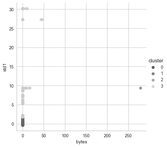
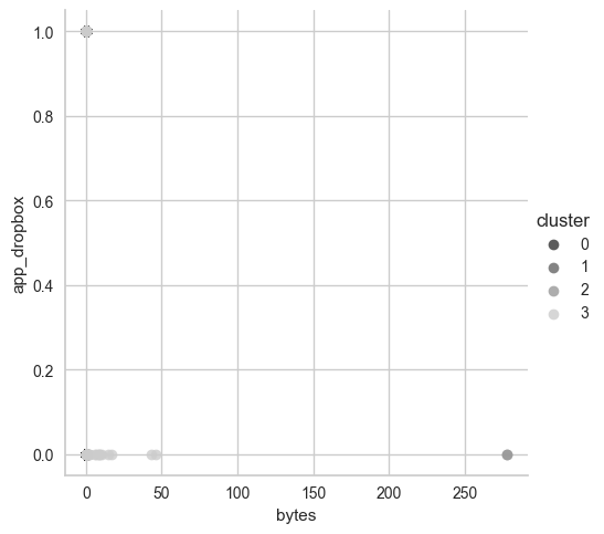
We can visualize it each cluster using 2D plot with two variables, the following is a representation of bytes and std1:
The second is with bytes and app_dropbox (this might be very important later):
Then we count each data point and group it into cluster, then visualize them:
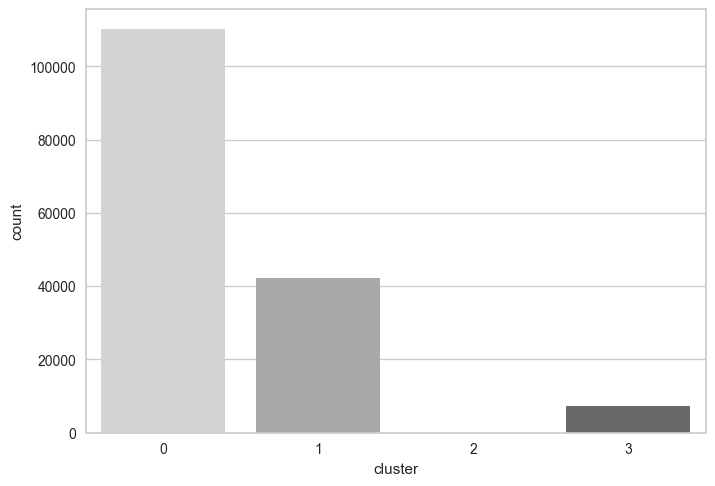
This is a bit different from the graph in the book, because each time the code is run, each data point might be in another cluster. The cluster labels changed and can be permuted each run, but the exact numbers are the same:
cluster
0    110085
1     42279
3      7328
2         2
What really stands out is cluster number 2 and cluster number 3. Cluster number 2 contains 2 data point and they need to be analyzed. Remember that:
anomalous doesn’t mean malicious; it indicates only that the events are different.
So let’s start from this: we want to exclude normal traffic (first, we copied the content of column from df_features_one_hot_enc to a new column, cluster, in df)
df[
    (df.cluster == 2) \
    & (df['src_ip'].str.startswith('10.')) \
    & (df['dest_port'] != 9997) \
    & (~df['dest_ip'].str.endswith(".255")) \
    & (~df['dest_ip'].str.contains("20.7.1")) \
    & (~df['dest_ip'].str.contains("20.7.2")) \
    & (~df['dest_ip'].str.contains("20.10.31.115")) \
    & (~df['dest_ip'].str.contains("168.63.129.16")) \
    & (~df['dest_ip'].str.contains("169.254.169.254")) \
    & (~df['dest_ip'].str.contains("239.255.255.250")) \
    & (~df['dest_ip'].str.contains("13.107.4.50")) \
].groupby(['src_ip', 'dest_ip', 'dest_port', 'std1', 'count1']).size()
The code snippet above represent the exclusion based of several factors that were discussed in Chapter 7. Yes, you should buy the book as I’m not reporting every single detail 😛. But it’s sufficient to say that the goal is to filter normal traffic based on known address and ports.
No results for this cluster.
Let’s analyze with the same query cluster 3. The result is:
src_ip     dest_ip       dest_port  std1        count1
10.0.0.12  40.87.160.0   23456.0    206.440273  201       202
10.0.0.13  40.87.160.0   23456.0    230.159154  168       169
10.0.0.15  40.87.160.0   23456.0    208.076508  194       195
10.0.0.16  40.87.160.0   23456.0    277.237105  157       158
10.0.0.18  162.125.2.14  443.0      260.327212  237       238
10.0.0.4   40.87.160.0   23456.0    211.475951  197       198
10.0.0.4   162.125.2.14  443.0      318.094573  188       189
10.0.0.6   40.87.160.0   23456.0    319.823560  147       148
10.0.0.8   40.87.160.0   23456.0    200.073430  164       165
10.0.0.9   40.87.160.0   23456.0    206.276419  171       172
The 40.87.160.0 is an interesting IP address. In Chapter 7 we discovered it was a false positive used for Splunk Stream, so when we filter that IP, here’s what we get:
src_ip     dest_ip       dest_port  std1        count1
10.0.0.18  162.125.2.14  443.0      260.327212  237       238
10.0.0.4   162.125.2.14  443.0      318.094573  188       189
And finally we have those! These are the same two connections discovered in Chapter 7. Why these are malicious? Here’s a brief recap.
In the previous chapter, we discovered that a Dropbox client on two internal host were compromised (10.0.0.18 and 10.0.0.4) The infected machine was exhibiting beaconing behavior with jitter, communicating regularly with an IP address associated with Dropbox. Upon deeper inspection, we identified the use of Empire, a post-exploitation framework, with a PowerShell stager that enabled the attacker to maintain remote access to the host via Dropbox-based C2 (command and control) traffic.
The adversary leveraged Dropbox's infrastructure to blend in with legitimate traffic. However, by analyzing time differences between connections (time_diff_sec, also used in Chapter 6), we noticed uniform jitter patterns, a known indicator of automated beaconing. These patters became detectable through clustering and statistical filtering using IQR to isolate the core distribution and mitigate the effects of outliers.
Finally, when we applied ML techniques in this chapter, two anomalous connections stood out. Upon correlating with prior knowledge, we confirmed that these matched the same hosts and behaviors we previously identified as malicious Dropbox-based C2 traffic.
Exercises
Here’s the exercises with their possible solution:
For the exercises, we are asked to run the Silhouette analysis using KElbowVisualizer with k values of 2 to 12 (k=(2,12)) and answer to the following questions.
- Provide the code you used to run Silhouette analysis, record the run time, and show the output of running the code. The code for the Silhoutte analysis is the following:
df_features_one_hot_enc = df_features_one_hot_enc.drop(['cluster'],\
    axis='columns')
%%time
model = KMeans(random_state=1)
visualizer = KElbowVisualizer(model, k=(2,12), metric='silhouette')

visualizer.fit(df_features_one_hot_enc)
visualizer.show()
plt.show()
The %%time command helps by keeping track of the time it spent. I run it two times, averaging more than an hour per run.
- Run the same range of k using the elbow method, compare the time it takes compared with Silhouette analysis, and compare the proposed optimal value with what we saw in this chapter. The code for the elbow method is the following (the same one used in the chapter):
%%time
model = KMeans(random_state=1)
visualizer = KElbowVisualizer(model, k=(2,12))

visualizer.fit(df_features_one_hot_enc)
visualizer.show()
plt.show()
Running the code took 4 seconds, which means the elbow method on my machine was 900x times faster.
Which is faster—the elbow method or Silhouette analysis—and why? The elbow method was faster because of the way it works. It only requires computing the intra-cluster distances (i.e., how compact each cluster is).
Silhouette Analysis, on the other hand, evaluates how well each data point fits within its own cluster compared to the nearest neighboring cluster. It computes a score for each value of k that reflects both intra-cluster cohesion and inter-cluster separation.
An important point to consider is practicality. In our setting, as threat hunters, we aimed to test a hypothesis quickly and perform an initial exploration of the dataset. While the elbow method may not yield the most accurate k, it provided a sufficiently good estimate in just a few seconds. On the other hand, Silhouette Analysis took around an hour to run, tough more accurate. If we were optimizing for precision, especially in a critical detection scenario, waiting longer for a more accurate k via Silhouette would be reasonable.
Conclusion
I looked forward to reading this chapter (perhaps was the reason I initially bought this book). I was eager to learn more about integrating ML into a threat hunting work. Working through the material, running the experiments, and seeing how clustering could help surface subtle anomalies has been incredibly rewarding.
The goal remains the same: hold myself accountable and keep pushing forward.
See you next time, thanks for reaching this far!